Game developers often prioritize prototyping their games but tend to overlook essential elements that need attention around the main gameplay – you know, the less glamorous aspects like menus, settings, tutorials, and more. As Elon Musk says, ‘Prototypes are easy; production is hard!’ To create an exceptional game, you must include all these components.
In this tutorial, we will discuss menus – how to create them and how to make them engaging to draw players into the game. Unfortunately, Godot developers have over-engineered the user interface nodes, making it quite complex. It might seem like you need a master’s degree in Godot’s UI system to make it work.
This tutorial will be divided into three parts:
- Part 1: Introduction to Godot’s user interface system and a presentation of the menu hierarchy I was able to create.
- Part 2: A deep dive into the UI node and scene hierarchies that form a visually appealing menu system.
- Part 3: Touching on menu feel, game settings, and audio control for the menu system.
The Menu Hierarchy I Created Using the User Interface System in Godot 4
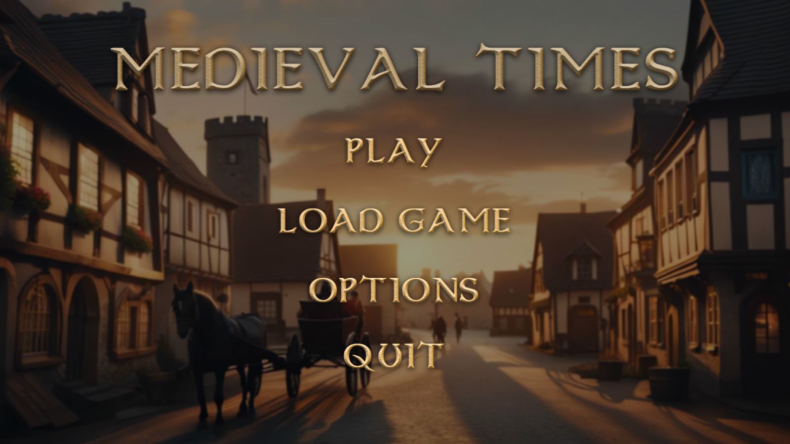
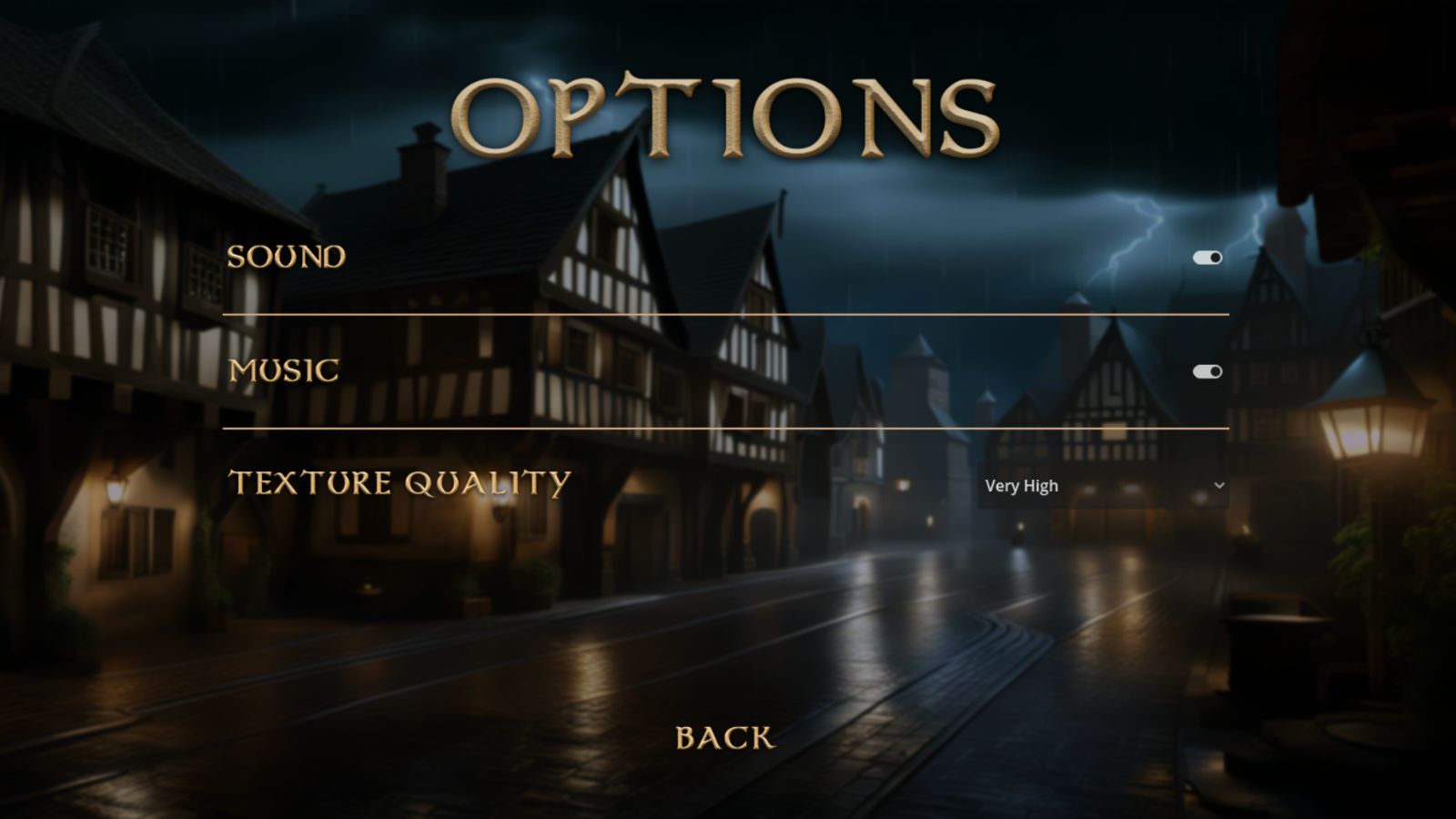
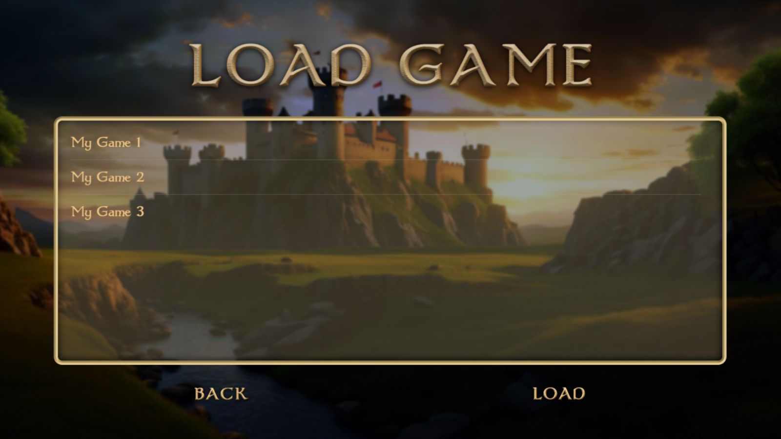
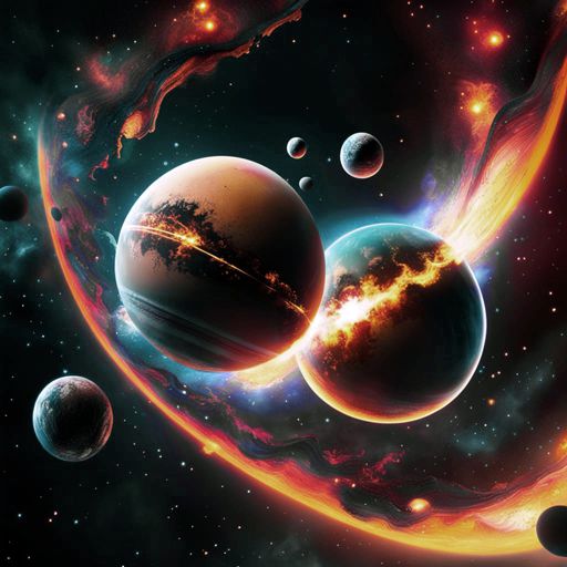
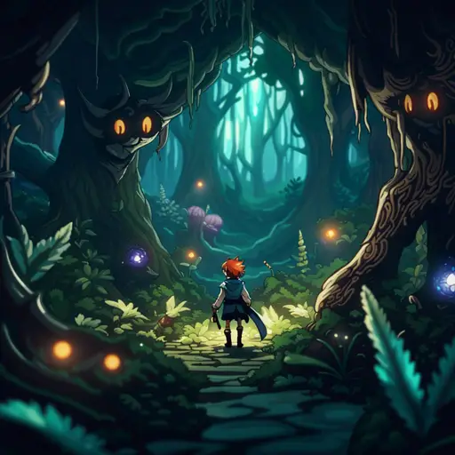
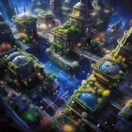
Before we delve into the content, I’d like to demonstrate what can be achieved using the user interface system in Godot 4 and provide you with some inspiration as you read through these articles. Take a look at the images below as see the menu hierarchy I managed to create within just a few days. Disclaimer: This isn’t an actual game; it’s simply a showcase of the UI system’s capabilities within the Godot 4 game engine.
Introduction to Godot’s User Interface System
Godot’s user interface system is a collection of nodes that allow you to construct and customize your own user interface. When I mention ‘user interface,’ I’m referring to anything you need to present in a 2D flat view that provides the user with control or information about the game. This could include elements like menus or a HUD (heads-up display). All user interface node icons in Godot are represented in green.
I had the pleasure of using Microsoft’s WPF framework with XAML in Visual Studio, designed specifically for user interface creation. WPF is an incredibly impressive framework for building user interfaces. Godot still has some catching up to do in this aspect. Nevertheless, Godot has its own unique charm.
The Control Node Is the Parent of All User Interface Nodes
As you might have noticed, Godot’s user interface system, along with the node system in general, is constructed based on the concept of inheritance. In this structure, each node inherits certain properties from its parent and introduces its own unique attributes.
All user interface nodes inherit from the ‘Control’ node, which serves as the foundational node for a user interface element. The ‘Control’ node has several properties, including element layout, input event control, element themes and styles, and a variety of other configurable options.
The ‘Control’ node lacks a visual representation, yet it contains all the fundamental properties of a user interface element. So, while directly using a ‘Control’ node might seem unnecessary, you use it indirectly when you create a node that inherits from it. However, I have found one case where using a ‘Control’ node is suitable – that is, to function as an object container, primarily for organizing your nodes into groups.
Example: The Button Node Is a Type of Control
The button node is a type of a UI element that introduces additional functionality and properties in addition to the properties of the ‘Control’ node. For instance, a button includes button text, an optional icon, unique button signals, and specific options connected to the button’s behavior in certain scenarios.
User Interface Node Hierarchy in Godot
The Godot engine features numerous types of user interface nodes, with some of these nodes inheriting properties from others. As I mentioned in the example above, a ‘Button’ is a type of ‘Control’, and a ‘CheckButton’ is a type of ‘Button’. This means that a CheckButton inherits all the properties of a Button while also introducing additional options.
Godot’s user interface system is built upon an extensive hierarchy of node types. As shown in the image, there are various kinds of user interface elements available for selection.
The nodes in the image are a partial list of the available UI elements you can choose from. This list changes and expands over time, as the development of the engine continues.
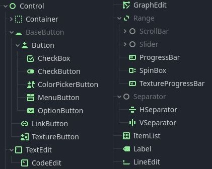
Most Common UI Nodes You Will Use to Create a Menu in Godot
The list below contains the most used user interface elements in Godot. You might need other elements to make an in-game HUD (heads-up display), but for menus, these are the main ones.
TextureRect / ColorRect
TextureRect and ColorRect nodes are excellent choices for backgrounds and overlays. Unlike the Sprite2D node, which inherits from a Node object, the TextureRect and ColorRect nodes inherit from Control. This indicates that they are influenced by the layout settings of their parent node. These nodes can be used independently or combined. For instance, you can insert a monochromatic background image into the TextureRect node and layer it with a vibrant gradient using the ColorRect node.
Margin Container
Containers in Godot come in handy when you want to change a group of nodes all at once. Take the margin container, for example. It lets you tweak the space around one or a group of UI elements. Imagine you want to add some space between the screen’s edge and your menu contents. That’s where the Margin Container shines. Just toss all your menu items inside it and set the margins for each side in the Inspector panel. This makes sure that all your menu items stay comfortably away from the screen edges, just the way you want.
VBoxContainer / HBoxContainer
VBoxContainer and HBoxContainer are containers that let you stack items either on top of each other or side by side. VBoxContainer stacks all its child nodes vertically, while HBoxContainer lines them up horizontally. These UI nodes are super handy when crafting menus because most menus involve some kind of list, whether it’s buttons, saved games, or just a bunch of UI elements. As I’ll show you in the next part of this series, I use these elements multiple times in each menu.
Labels
A label is a straightforward text box that you can utilize for your menu title or any other text you require in your menus. Labels do come with a notable limitation – you can’t really apply visual styles to them. Sure, you can tinker with the font and style a bit, but you can’t slap on filters or effects to give it a polished look. For more design freedom, you could turn to a RichTextLabel, but it’s not as versatile when it comes to making visually appealing text. If you’re familiar with Photoshop, you get the idea of how incredibly powerful filters and layer effects can be.
Buttons
Buttons are quite straightforward. Every menu needs some type of buttons. You set up styles for the normal, hovered, disabled, and pressed states of a button. Then you connect the button’s pressed signal to a function, implement it, and ta-da! You’ve got a functional button. Remember that Godot offers various button types. If you’re after a plain button, you should opt for a simple ‘Button’ node.
I personaly love to use the TextureButton since it allows me to design a nice looking button in photoshop and attach the textures for each of the button states, instead of using simple text.
NinePatchRect
In most games and menus, you often come across frames, like in a ‘Load Game’ menu, where the background serves as the frame and the list of items is simply text. When your game is displayed on different monitors or on a different window size, the frame image can get stretched and end up distorted. Frames usually have some decorative design around them that shouldn’t be stretched, whereas the center of the image can often be stretched.
The NinePatchRect node comes into play here. You feed it an image along with patch margin settings, and it ensures that the margins you’ve defined remain unstretched. The center part might be stretched, but the decorative frame itself remains intact. You can also choose how the center part gets filled – whether through stretching, tiling, or smart tiling. This node is fantastic for creating simple frames, like the ‘Load Game’ item list I mentioned earlier, ‘Save Game’ item lists, or options lists within the ‘Options’ menu.
ItemList
An ItemList is a collection of items, usually text, and sometimes even accompanied by small icons. This node comes in handy when you need a well-organized list of items, such as a list of saved games. When users navigate to the ‘Load Game’ menu, the ItemList should be filled with the file names of saved games from the game folder (or any other way you save games to the disk). It also includes appealing borders between items and handles the scroll bar automatically when necessary.
Most Important Properties You Need to Create a User Interface in Godot
The list below contains the most important properties you will use when constructing a user interface. These properties control the UI node layout, styling, input events and general node parameters.
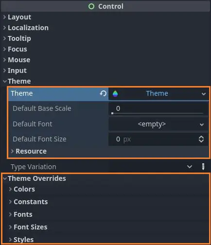
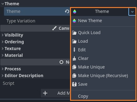
Theme Resource & Theme Overrides
You can find the ‘Theme’ resource and ‘Theme Overrides’ sections under the Control node properties in the ‘Inspector’ panel. The ‘Theme’ resource is in charge of how your UI node looks.
While the theme you set up gives you the basic design, the ‘Theme Overrides’ section lets you quickly change some of the theme settings. This is handy when you want to try different designs without messing with the main theme.
One big deal with a theme is how your UI node is styled. Each state of the node gets its own style. Like, for a button node, you got Normal, Hover, Pressed, Disabled, and Focus states. Usually, you’d want each of those button looks to be different.
That’s where the style resource comes in. I usually use it to make the button’s background image pop, but you could get creative with other stuff too.
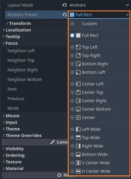
Layout – Anchor Presets
The anchor presets define how your UI node anchors to its Control parent. This option is only available to child nodes of a Control.
You can adjust this setting either in the ‘Control’ properties within the ‘Inspector’ panel or by clicking the preset button in the top menu bar of your scene window. Just remember, for these presets to work, the ‘Layout Mode’ must be set to ‘Anchors’.
If you’re aiming to make your UI cover the entire screen, the ‘Full Rect’ preset is the way to go. Otherwise, you can select a different preset that fits your requirements.
The attached images demonstrates all the achoring options currently available in Godot 4.
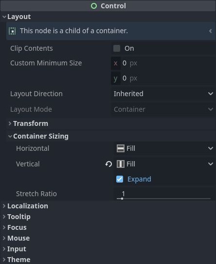
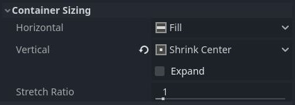
Layout – Container Sizing
This property is one of the most crucial aspects of a user interface node. The container sizing determines both the position and dimensions of your node within its parent. Here are the properties under your control:
- Horizontal Size: Dictates the node’s behavior on the horizontal axis. A ‘Fill’ value stretches the node to fit in the available space provided by its parent, while any other value shrinks the node according to its contents’ size or other defined minimum size.
- Vertical Size: Similar idea as the horizontal size. A ‘Fill’ value stretches the node to match the available size in the parent node, while any other value shrinks it to its minimal dimensions.
- Expand: This choice appears under either the ‘Horizontal’ or ‘Vertical’ size options, based on the parent. It manages the node’s size relative to other nodes within the same container. For instance, a VBoxContainer with multiple buttons won’t automatically adjust button sizes unless you define them in the ‘Custom Minimum Size’ section or check the ‘Expand’ checkbox. Enabling the ‘Expand’ checkbox for all buttons in the VBoxContainer will lead to evenly distributed buttons.
- Stretch Ratio: This ratio specifies how much space each node occupies in the container relative to its siblings. A ratio of 1 distributes space equally. Suppose you have 4 buttons in a menu, and you assign one button a ratio of 2. In that case, its size will be twice as large as the others.
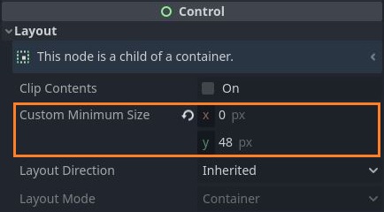
Custom Minimum Size
This property refers to the minimum size of a node’s bounding box. It’s handy for establishing a constant size for a node. For instance, the horizontal size of a button shouldn’t rely on screen size, as we want to avoid stretching the button texture on various types of monitors.
In this case, the Horizontal size should be set to ‘Shrink Center’ (or any option except ‘Fill’), and the custom minimum size in the X axis needs to be defined as the desired button width in pixels.
No matter which container sizing option you choose, the minimum size you define will always be enforced.
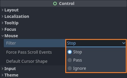
Mouse Events Filter
The mouse event filter comes in handy when you need to enable or disable mouse events for a specific scene. A prime example is a screen transition node for fade-in or fade-out effects. To achieve this effect, you’d typically use a black ColorRect node and adjust its opacity. Unfortunately, this can lead to a problem where the mouse events only register on the ColorRect node and not on the actual scene you intend to show (since the ColorRect is positioned above the scene).
To overcome this problem and ensure that mouse input events are transmitted, you can modify the ‘Filter’ property under the ‘Mouse’ section in the Inspector panel to ‘Ignore’. This action will cause all mouse events to be disregarded for this node, allowing them to pass through to the subsequent node, which, in this case, is the scene displayed on the screen.
How Do Menus and Their Child Nodes Communicate With Each Other?
In many situations, you’ll have to share and pass information between different menus and the nodes inside them. There are different ways to do this, but a clear way is by using signals. A Signal is like a message that nodes send to each other when some event happens. Sometimes, you might need to make your own signals to send specific data between your menus and nodes.
This topic is important and is used in my menu hierarchy. To understand better the architecture of the menus I have built, I suggest reading How to Use Signals for Node Communication first.
A Word About User Interface Theme and Style Resources
Most of the time, you’ll have menus with more than one button. These buttons should all look the same to keep your menu from looking all funky.
Now, setting up each button’s style one by one could take a long time. But here’s the cool part: Godot has a good resource system that lets you create a style or theme and save it.
You only have to style your buttons once, save that style or theme, and then apply it on all the other buttons in that menu or any other menu you’ve got. Sure, your styles might need tweaks as your game comes together, but it’s way better than updating every single element to match. Skip the manual work and make Godot’s Resource system work for you!
The resource system in Godot is a fascinating topic. Learning the inner workings of Godot is important and may give you an advantage in your development efforts. Go to https://docs.godotengine.org/en/stable/tutorials/scripting/resources.html to learn more about resources.
Another important usage of resources is creating custom data structures and containers. Complex data structures are an integral part of any large, high-quality game, and I have a specific article about this topic. If you are interested, read Easy Steps for Building Large Data Containers with Resources in Godot 4.
Limitations of the UI System in the Godot Engine
A lot of these limitations are based on my personal opinions, and they stem from comparing Godot’s user interface system with WPF. Here are a few major concerns I have.
Most User Interface Containers in Godot Have a Single Function
In the world of WPF, every UI element can do so much – control its position within its parent, manage its looks, alignment, and pretty much anything you can think of. But in Godot, UI nodes and containers don’t have that kind of power. Let’s take the ‘Center Container’ as an example. Why even bother having a special container just to keep things in the center? Why not just add a checkbox in the ‘Control’ node to do that? This way, every UI node could have this feature and we could forget about the Center Container altogether.
The same idea goes for the Margin Container. Why do I need a dedicated container just for margins? Wouldn’t it be better if I could set margins for any UI node? Getting rid of all these containers that only serve one purpose would significantly streamline the scene tree and give Godot’s user interface system a lot more flexibility. These are just two instances, but there are plenty more.
The User Interface Grid System in Godot Is Not User Friendly
After tinkering around with Godot’s UI system, I’ve got a pretty good grasp of how it works. However, when I compare it to Microsoft’s WPF framework, I notice some significant drawbacks. WPF’s user interface system feels more human-friendly because it revolves around grids as the foundation for layout.
Whenever you want to add a UI element, you simply place it in a grid, which divides the parent’s bounding box into rows and columns. Once you set the grid dimensions, you have precise control over each row or column’s size – either by specifying exact pixel values or percentages. This results in incredibly adaptable layouts that adjust perfectly when the window size changes.
In Godot, things get a bit messy because sizing isn’t controlled by a grid; it’s determined by the individual elements. As I discussed in the earlier sections, each element can fill its parent’s bounding box, expand, or center based on a minimum size. This can be a bit confusing and takes time to get used to.
Personally, I wish I had the option to create a ‘Grid’ node, define the number of rows and columns, and then assign the pixels or percentage each row or column should occupy. Then, for each child node, I could simply specify the (x, y) coordinates within the parent grid. That would be really intuitive. But maybe it’s just me. What’s your take on this? Feel free to share your thoughts in the comments section below.
Lack of Options for Designing Text in the Godot Editor
Crafting attractive text for titles and button labels can be quite a challenge. While I understand that Godot isn’t a full-fledged graphic design tool like Photoshop, it’d be really helpful if there were some tools available. Here are a few effects I’d love to utilize: bevel, inner shadow, glow, and texture noise. Having these effects at my disposal would save me the trouble of making text images separately and importing them into Godot. Not to mention, experimenting with different styles and fonts can take a huge chunk of time.
In some situations, achieving this is downright impossible. Take a clock, for example. When you need to update the digits in the text every second, creating a font image with the desired style becomes impractical. This negates the advantages of using True Type font files. Visual effects should be applied after the font is defined and the text is updated, which implies that the editing must be done right within the Godot editor.
Conclusion
In the next part of this series, I dive deep into my menu and explain how and why I did things the way I did.
For more information on user interface in Godot, you can read the official documentation at https://docs.godotengine.org/en/stable/tutorials/ui/index.html.
Creating menus and user interfaces is just a small piece of the whole game development puzzle. If you’re aiming to become a skilled game developer, come along with me on this journey of mastering all the essential skills needed to make awesome and innovative games. Getting good at everything might take some time, but you can start by checking out my Night Quest Games Blog. I wish you all the best and good luck!
If the information in this article was helpful to you, please consider supporting this blog through a donation. Your contributions are greatly appreciated and allow me to continue maintaining and developing this blog. Thank you!
Hi, I’m trying to put a bunch of buttons in a group and later do some stuff with them.
So first I assign all the buttons to a button_group. Then I save that group as a resource, put all the buttons under a control node, and add a
@export var btnGroup_available : ButtonGroup
to the control node. Then, in the editor I drag and assign the “btnGroup_available” to the exported variable. To make sure things work, in ready function of the control node I check whether it’s all registered using
for B in btnGroup_available.get_buttons():
print(B)
And this works great!
In the instructions it is claimed that button groups work with “A group of BaseButton-derived buttons.” (https://docs.godotengine.org/en/stable/classes/class_buttongroup.html#description) so I expected this code to work with menu buttons too. But it doesn’t, and nothing gets registered at all. I tried various things, but nothing seems to work. Does that mean “get_buttons()” works only with literal buttons?
Actually… now it works. What I had to do is right click on one of the buttons, copy the Group, and go and paste it everywhere else 😛 I guess dragging the resource into the exposed controller variable was where the mistake was.
Thank you for sharing this!
You are very welcome! 🙂